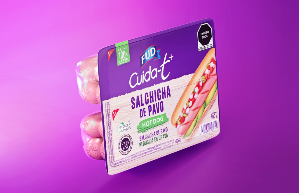
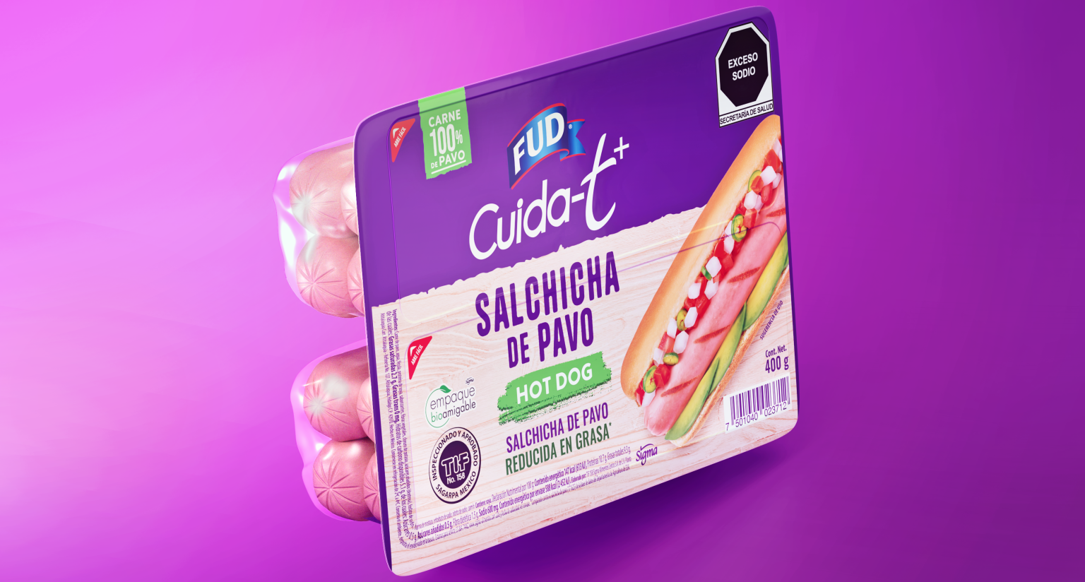
Visual consistency and color psychology are crucial in packaging design for catching the eye of consumers and leaving a lasting impression on retail shelves. This article delves into the importance of visual consistency and the continued relevance of color psychology in today’s fastpaced market.
The significance of visual consistency in packaging design cannot be understated
Maintaining a consistent brand identity is essential for businesses, and using consistent colors across different packaging elements is a powerful tool in achieving this. It helps companies establish strong visual recognition and recall among their target audience. Visual consistency across all aspects of packaging, including logo color, packaging background, and accents, builds brand loyalty and differentiation. A cohesive visual experience is vital for engaging consumers and making a strong impression. Packaging designers achieve this by harmonizing color schemes and palettes throughout the design. By carefully selecting and coordinating colors, they ensure packaging elements blend together seamlessly, creating an aesthetically pleasing and memorable journey for the eyes. This cohesion extends beyond packaging to consider how the design enhances other marketing materials and branding efforts.
The use of color is an important psychological factor in packaging design
Colors have the ability to elicit emotions and affect consumer behavior. Comprehending the psychological effects of varying colors enables packaging designers to purposefully choose shades that match the desired brand image or product attributes. For instance,
- Red: Is energetic and attention-grabbing
- Blue: Is reliable and trustworthy
- Green: Represents natural and eco-friendly
- Yellow: Is optimistic and playful
- Orange: Is associated to food and appetite
- Pink: Is feminine and youthful
- Black: Is sophisticated and elegant
- White: Is pure and clean

Colors can hold diverse cultural and symbolic meanings that differ between societies. Packaging designers utilize these associations to influence consumer perception and behavior. For instance, warm hues, such as red and orange, can create a sense of excitement or urgency, whereas cooler shades, like green or blue, can evoke feelings of serenity or trust. By selecting colors that align with the brand’s message and the target audience’s preferences, designers aim to elicit specific emotional responses that encourage favorable consumer actions.
Aligning color choices with the target audience
To effectively use color in packaging design, a deep understanding of the target audience is necessary. Demographics, cultural backgrounds, and individual preferences all play roles in determining colors that resonate with specific consumer groups. For instance, a product aimed at children might use bright and playful colors, whereas a product aimed at a more mature audience could employ more subdued and refined shades. Aligning color choices with the preferences and expectations of the target audience enables brands to create packaging that appeals directly to consumers’ sensibilities.
The relevance of color psychology
The field of color psychology is constantly evolving as scientific studies shed light on its impact on human behavior and perception. Research findings consistently support the significance of color as a powerful tool for influencing consumer decision-making. From traditional color associations to contemporary color theories, color psychology is still an important aspect of packaging design.
Overcoming Cultural Biases and Assumptions
Cultural context and interpretation have a significant impact on color symbolism, which makes it crucial for packaging designers to be mindful of these cultural differences in today’s globalized markets. By considering cultural nuances and avoiding assumptions, designers can ensure that their color choices have a positive impact on consumers from diverse backgrounds.
Innovations and Evolving Trends in Color Psychology
The evolution of color psychology introduces new theories and models that enhance our understanding of the complex relationship between color and human psychology. Technological advancements have created opportunities for integrating color psychology into packaging design. Designers are continuously exploring color experiences through the use of augmented reality and innovative light-interacting materials, pushing the boundaries of color psychology in packaging design. Visual consistency and color psychology are essential factors in packaging design, enabling brands to establish a distinct identity and enhance their presence on store shelves. Consistency across all packaging elements is key. The strategic use of colors, based on psychological associations, molds consumer perception and emotions, ultimately influencing purchasing decisions. Although the relevance of color psychology may be debated, its impact and efficacy are substantiated by scientific research and real-world applications. By staying informed about new developments and considering cultural sensitivities, packaging designers can harness the profound power of color to create compelling and persuasive packaging designs.

